
Three Briefs
Bill Scott at Hollis Taggart; Susan Sykes at Bernaducci-Meisel, Joanne Mattera at OK Harris
By Maureen Mullarkey
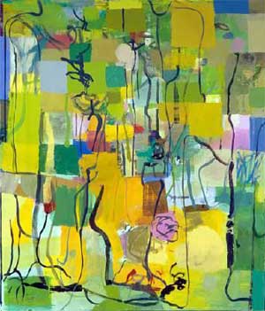
As Bill Scott tells it, the best part of growing up in suburban Philadelphia was access to the Barnes Foundation and its collection of French painting. His initial attraction to French sensibility was validated and strengthened by his friendship, as a young painter, with Jane Piper, a favored protégé of Arthur B. Carles. A great colorist, Carles was influential in introducing the sensuous ebullience of French modernism to American audience. Mr. Scott places himself in a line of descent that runs from Carles through Piper, and encompasses an informal school of Philadelphia colorists.
 |
| Bill Scott, Summary |
A painter with roots in gestural abstraction, Mr. Scott is a master of fine-tuned tonal relationships. He has a gift for manipulating split complements into myriad subordinate hues and lively neutrals that lessen tonal rivalries and enrich the overall design. “Twenty Four Stories” (2004) is a particularly satisfying example of the way competing hues maintain their individual vitality when partnered with neutral passages. Beautiful lozenges of deep olives, umbers, siennas and indefineable greys work an earthen magic among pulsing rectangles of full color: yellows, oranges, cerise, bright greens. Most works on view, however, keep the temperature up to ornamental levels and rely willy-nilly on meandering black lines to bind color notes together.
The exhibition includes several small color drypoints and etchings. Tucked into a rear corridor, these are delicious companion pieces to the paintings. On plates no larger than 8 by 8 inches, “Landscape with Trees I” (2005) and “A Broken Promise” (2005) achieve in miniature the correspondence between linear structure and color schemes that the larger paintings intend.
I miss the tonal vigor of Mr. Scott’s work of a decade ago, when he was exhibiting in Philadelphia. The virility of those earlier paintings has given way to a complacence that announces itself in spidery lines too febrile to provide the needed structural cues that puntuation is meant to supply. The restive chromatic flutter of these canvases wants an anchor. Bonny passages of darksome tones, carefully placed, offer needed stability while, at the same time, unsteady markings negate it. Bill Scott is too accomplished a painter to go pretty on us now.

For artists, the hectic succession of modern art movements makes getting out in front a horse race without a finish line. In the late 1970’s, Jim Dine noted: “Much of what is called postmodernist art is made by people frightened to death of not being called new.” Susan Sykes does not frighten easily. Her response to the tyranny of media- and market-driven obsessions with novelty is to embrace a mode unarguably past its prime. She sidesteps the fallacy of progress in art by aligning herself with photorealism — then upending it.
 |
| Susan Sykes, 47th & 5th |
Ms. Sykes’s first exhibition with Bernaducci-Meisel is engaging and impressive. Her paintings are based on vintage urban photography from the 1930s and 1940s. She interprets black and white originals in full color, replacing the objectivity of the camera with subjective harmonies and carefully considered chromatic textures.
Photorealism rests on a single technical feat — making a painting look like a photograph. Ms. Sykes turns the mechanically produced image of a photograph into a painting. She forgoes oil paint’s soft-focus blendability for the pooled edges of water color, a choice that places greater demands on spontaneous expertise.
The delicate, eddying hues on the rain-soaked street of “Arrow Beer” (2007)
provide painterly contrast to a blackened night sky that swallows a dark sign board. Only the neon letters of the product name penetrate the gloom to hang in the air like fireworks. In “North Avenue at Charles Street, 1944 Baltimore” (2007), a yellow trolley establishes the key around which other tones find their proper place.
Photorealism is a cool style; it maintains a certain detachment from both the motif and its visual counterfeit. There is nothing cool about Ms. Sykes’s approach. It is implicitly nostalgic, an affectionate backward glance to the “look” of an era warmed by the spectrum. With emphasis on cars, fashions, movie marquees (Charlie Chaplin, Ruth Hussey, Jimmy Stewart), bill boards with bygone products (Lucky Strikes, Ruppert’s beer), time itself is the reigning motif.
On view are two decades in the history of style, removed from the seismic events of their time. Ms. Sykes reclaims documents of an era and returns them to us as art.
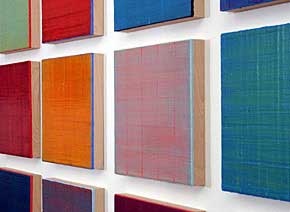
The ancient, labor-intensive process of encaustic painting has come a long way since art historian H.W. Janson, in 1941, declared it an “almost forgotten medium.” If Jasper Johns put it back on the map in the 1950s and 1960s, Joanne Mattera has been a prime mover in making the technique accessible to a new generation of painters. Her handbook “The Art of Encaustic Painting” is the reigning manual for contemporary artists drawn to the surface qualities and translucence for which the medium is known.
 |
| Joanne Mattera |
The medium itself is very much the subject of “Silk Road,” Ms. Mattera’s series of small encaustic panels on view at OK Harris. Each panel is a simple expanse of what appears, at quick glance, to be a single color. But owing to the opalescent properties of pigmented beeswax applied in layers, these radiant fields are irreducible to monochrome. Cunning visual subtleties are the raison d’etre of the series.
#87 appears superficially as red but the panel cools, through a preternaturally delicate scumble, to a nimbus of pale blue that rises upward from the bottom edge like polar rays on the horizon. The red itself undergoes shifts in intensity from layer to layer (10 of them). #90 spreads a luminous green-yellow over clear vermilion that asserts itself between the interstices of the covering brush strokes that crisscross right to left and top to bottom. Each panel achieves the woven quality of a textile, the warp and woof of exquisitely controlled brushwork.
If no panel is truly monochrome, neither is any color totally opaque. Light is held in the depths of the wax; color is suspended within the body of the medium. You look into the panels, not simply at them. Unseen underlayers display themselves naked at the edges in counterpoint with the dominant color.
The refinement of Ms. Mattera’s touch is all the more impressive weighed against the handling properties of encaustic, which work against finesse. Encaustic begins to cool–and harden–the instant a brush leaves the heated palette. Speed of application is critical. Ms. Mattera’s panels are no larger that 12 inches square because that is as far as a single, discriminating brush stroke can be sustained on an unwarmed panel.
Resonance from within lends depth to understated surface patterns. Viewed in ensemble, there is nothing minimal about them.
“Bill Scott: Looking Through” at Hollis Taggart Galleries (958 Madison Avenue, 212-628-4000).
This review appeared first in The New York Sun, 15 March 2007.
“Susan Sykes: Recent Watercolors ” at Berndaducci.Meisel.Gallery (37 West 57 Street, 212-593-3757).
This review appeared first in The New York Sun, 12 April 2007.
“Joanne Mattera: Silk Road” at OK Harris until May 26 (383 West Broadway, 212-431-3600).
This review appeared first in The New York Sun, 3 May 2007.
Copyright 2007, Maureen Mullarkey


