
Books, Buildings and Embellishment
Alice Morse’s book covers at Grolier Club; Diana Horowitz’s painting
at Hirschl & Adler; Don Joint’s textiles and paintings at Frances Naumann Fine Art.
by Maureen Mullarkey
INFORMATION IS A TOOL BUT LOVE OF READING IS A WAY OF LIFE. And like any love, it has a physical dimension. There is more to it than simply ingesting print. It begins with pleasure in the look, feel and weight of a book. Some would argue that in our digital age, book arts matter more than ever before. No where do they matter more than at the Grolier Club, founded in 1884 to promote the arts of book production.
 |
| Alice Morse |
Modern bookbinding techniques were perfected to a fine art toward the end of the 19th century. During the zenith of the American Decorative Arts Movement, something of an aesthetic crusade, women rose to the fore of book cover design. Alice Cordelia Morse (1863-1961) was a frontrunner among the first generation of artists — displacing the customary dye-makers and engravers — to design commercially produced books.
This Grolier Club exhibition on the life and work of Morse owes itself to the passion and detective work of Grolier member Mindell Dubansky, preservation librarian in the Metropolitan Museum’s Thomas Watson Library. She discovered Morse’s designs ten years ago in a storage room of the Met’s Department of Prints and Drawings.
Ms. Dubansky, herself a collector of 19th century publishers’ bindings, came upon an uncatalogued collection of 58 covers in a old print box. Some had been removed from bound books; others, such as proof covers, had never been bound. All had been gifted to the museum by Morse in 1923 and exhibited in the library.
The cache prompted further research into the sparse details of Morse’s life and led to the discovery of additional covers that had not been previously attributed to her. As a result of Ms. Dubansky’s perseverance, over 80 splendid cover designs plus many binding variations and adaptations have been identified as hers. This Grolier Club exhibition marks the first time since 1923 that Morse’s work has been on display to the public.
Born in Ohio, Alice C. Morse was raised in Brooklyn at a time of emerging, reformer-driven opportunities for women in the post-bellum era. The slaughter of a generation of men widowed tens of thousands of woman and left thousands more
deprived of husbands at a time when women had few means of support outside the home. Morse, ambitious to support herself, trained as a designer at the Woman’s Art School at Cooper Union. Dedicated to training the working class in marketable skills, it was one of the few art schools in New York open to women at the time.
Commercial firms competed for Cooper Union’s graduates. Publishing houses sought students as illustrators, engravers, and book cover designers. Tiffany & Company, spurred by Louis Tiffany’s confidence in women’s design sense — politically correct in its time — hired many female students in glass decoration and interior design. It was the heyday of the American decorative artist as both an individual creator and a force in a growing marketplace.
Before committing to a career in book cover design, Morse studied with John La Farge, a poet in stained glass no less than in painting. She also worked for several years as a glass designer for Louis C. Tiffany. Her ability to interpret nature motifs and historical ornament is due, in no small part, to her experience at Tiffany & Co. She herself likened book design to stained glass: “I think book covers resemble glass more than, say, wall-paper or silk in that you have a complete design in a given space whereas wall-paper and silks repeat indefinitely.”
Fertile affinity between the two mediums is evident on every cover. Several of her early designs for Dodd, Mead & Company recall the floral wreaths La Farge translated so successfully from gossamer oils into the leaded confines of stained glass. The green plain-weave cloth cover of “A Rose of a Hundred Leaves” bears a paper onlay in the shape of a wreath of pink and green roses. Gold-stamped and edged with four tied ribbons, it represents Morse’s conviction that cover design should accord with the book’s subject. This was a love story; daintiness must reign.
There are considerable differences between historic and modern bookbinding procedures. Morse had a particular genius for interpreting older techniques in a manner suitable for modern commercial book design. One lovely cover follows another, each one an invitation to treasure the contents of the book.
The full sheepskin cover of “Writing to Rosina” is blind-stamped (an impression made in the leather with an engraved brass stamp)with an intricate pattern of open-winged butterflies. The wings form a cartouche at the top to hold the title. It is an exquisite example of Morse’s facility in retaining the feeling of a hand-tooled book.
One of Morse’s best known designs is the green, fine-ribbed cloth front cover for “Turrets, Towers and Temples,” a collection of essays on historic buildings by great writers. The all-over Gothic style foliate design is a tribute to the book as an embodiment of mind.
You leave this exhibition with a keener understanding of why the book arts matter. It is accompanied by an illustrated catalog with valuable essays by Ms. Dubansky, Alice Cooney Frelinghuysen, and Josephine Dunn. It includes useful discussion of the role of the Aesthetic and Decorative Arts Movements in underscoring the material and visual qualities that bind readers to books in the first place. This is art history at its best..

DIANA HOROWITZ IS A DEEPLY APPEALING PAINTER. She works within the tradition of open-air painting dear to artists from the seventeenth to the nineteenth centuries. Making gracious use of her antecedents, she balances the improvisational appeal of plein air against the demands of unromantic modern construction. This, her second exhibition at Hirschl & Adler, is a medley of 20 or so cityscapes of New York and several pastorales of Truro.
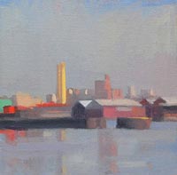 |
| Diana Horowitz, Yellow Smoke Stacks, 2007 |
Ms. Horowitz’s industrial sites along Brooklyn’s commercial waterways are not tourist destinations. The Gowanus Canal, once close to derelict, lingers as an unremarkable relic of the vital shipping hub that it used to be. The artist’s reserved and modulated handling of it gives back to the site a certain pride of bearing appropriate to an inlet explored by Henry Hudson and Giovanni de Verranzano. Each of these urban views carries a strong sense of the presence of the painter, of a selective temperament drawn to beauty in the structure of things.
In “Green Tanks” (2006), a row of pale viridian silos reaches across the middle ground. The foreground stretch of water, pale as the sky it reflects,
acquires a subtle pump of color from the additional reflection of the silos.
The rhythmic punctuation of a series of red shipping containers, seen
at distance as tiny rectangles, emphasizes the dark horizontal line of the loading platform.
Painting from direct observation, Ms. Horowitz necessarily limits the size of her canvases and panels. She keeps them portable so that she can return as often as needed to a chosen site. Her downward panoramas of the city, viewed from a height — “Ann Street Viewed from Above” (2007) and “East View on Vesey” (2007) — compress scenic detail with enviable economy.
There is strength in Ms. Horowitz’s lucidity and ability to convey a great deal of information in a contained space. And with a minimum of brushwork. “Yellow Smoke Stacks” (2006) is a jewel of a thing, less than 6 inches square. Yet the chromatic range, the interplay of suggested and depicted detail lends the piece a sweep and a solidity that many painters do not achieve on larger canvases. “Uptown, Summer” (2007) is a convincing evocation of the city seen through a curtain of haze.
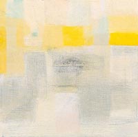 |
| Diana Horowitz, Yellow Square, 2007 |
A surprising addition to this show is a suite of several small abstract paintings interspersed among her signature motifs. These are not quite the anomalies that they first appear. They are keyed tonally to the plein air paintings; their complexion remains the same.
“Night Study” (2007) is just what its title suggests: a movement of nighttime tones that play across the canvas untethered to a locale. Here are the same rich darks—enlivened by a mixed black instead of one from the tube — that lend weight to “Black Building, Carroll Street” (2005), a view of the Gowanus. “Red Grid” (2007) makes a feast of variegated inflections of the same cadmium red that heats the foreground of “Wallabout Basin from Kent Avenue” (2005).
Tranquil and delicate, these abstractions carry less conviction than her depicted scenes. Each composition hovers over a faint, shifting grid that suggests spent emotion — as if the image had evaporated leaving behind some stain or imprint of its presence. Lovely color floats on a silken surface that bypasses pictorial structure. Ms. Horowitz is still feeling her way toward an internal architecture to support her chromatic agility.
“The Proper Decoration of Book Covers: The Life and Work of Alice C. Morse” at the Grolier Club (47 East 60 Street, 212-838-6690).
“Diana Horowitz: Recent Paintings” at Hirschl & Adler Modern until March 15 (21 East 70th Street, 212-535-8810).
Both of these reviews appeared first in The New York Sun on
February 28, 2008.
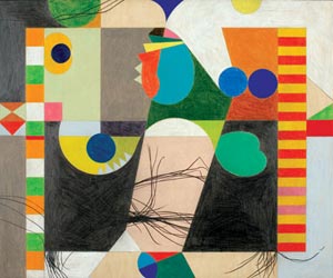
DON JOINT IS AN INVENTIVE, LIVELY PAINTER who makes quick work of false distinctions between fine and decorative arts. He is a fastidious craftsman and a winsome colorist with a freewheeling design sense.
On exhibit is a carnival of formal invention, much of it loosely triggered by the rhythms of old master compositions. Hence, the weighty titles like “Battle of the Sea Gods after Mantegna” or “Jesus and the Samaritan Woman after Duccio.” But take them cum grano salis, as the old boys said. The references lend sonority to what is, at heart, an exuberant gambol through patterned color compositions that require no rhetorical support.
 |
| Don Joint |
In this show, Mr. Joint returns to where he began a quarter century ago, in needle and beadwork. In addition to a medley of painted and penciled works on panel in the gallery’s front room, the back is hung with 8 small textile compositions. Here, in miniature, are his characteristic abstractions and colors worked in a variation on hooked rug technique.
The show’s theme, “Clobbered,” refers to an 18th century practice of repainting and re-firing old Chinese porcelains to conform to European tastes. He intends it to apply to his reworking of surfaces with graphite and colored pencil. But the real clobbering that goes on here is in Mr. Joint’s revivifying of an ancient textile technique.
Pulling one fiber at a time through the weave of a sturdy foundation is one of the earliest methods of textile manipulation. Fourth century Egyptians used it; so too, according to some sources, did Bronze Age Scandinavians. Wherever it began, it flourished during the 18th and 19 centuries in the Maritime Provinces and the northeastern United States.
Standardized commercial stencils, introduced in the early 20th century, debased the technique and hooked rugs passed out of favor.
Ever alert for different ways to embellish the surface quality of his geometric abstractions, Mr. Joint turned his hand to mercerized cotton. Worked on a closely woven linen backing, the pieces are necessarily much smaller than his paintings. The intimacy required for viewing is part of their appeal. Skeins of the same color but from different dye-lots vary slightly from each other, creating subtle tonal shifts within each color area.
That, and the looped pile of the thread itself, create the same tactile surface interest inherent in fine mosaic.
Every medium plays differently across identical surfaces. His larger designs on board — like “The Nightmare” (2007) or “The Mocking after Van Leyden” (2007) — exploit the textural properties of pencil worked and reworked over a wood grain that never fully disappears. An ensemble of smaller mixed media panels — such as The Holy Shroud” and Putto Porte-Guirande” (2007) make striking use of gold and silver leaf, punched, stamped and distressed against blackened grounds. No fake acrylic gilding for Mr. Joint. This is real gold leaf, inimitable in its texture and quality of light refraction.
Mr. Joint keeps controlled chaos from slipping into anarchy by binding a riot of disparate color areas with the precise linear and arabesque links common to decorative patterns. He gives rulers and French curves a good workout. In all, his painting is as pleasurable to look at as it was to create.
“Don Joint: Clobbered Works” at Francis M. Naumann Fine Art (22 East 80th Street, 212-472-6800).
Copyright 2008, Maureen Mullarkey


